All work

Case study

Trinitae Website
Redesign

Role Lead Service Designer
Company Trinitae Cosmetics
Platform Shopify 2.0
Focus Content · IA · UX · Shopify
Trinitae website redesign

Six years of technical debt — cleared.

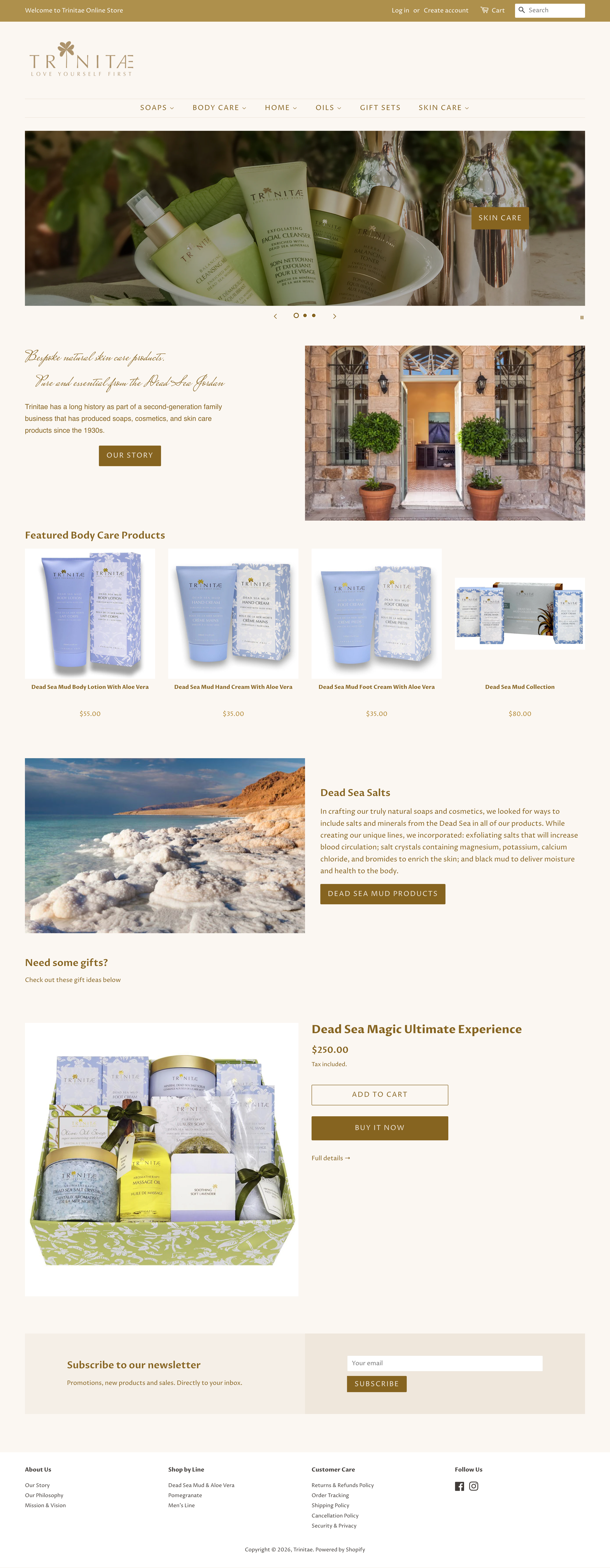
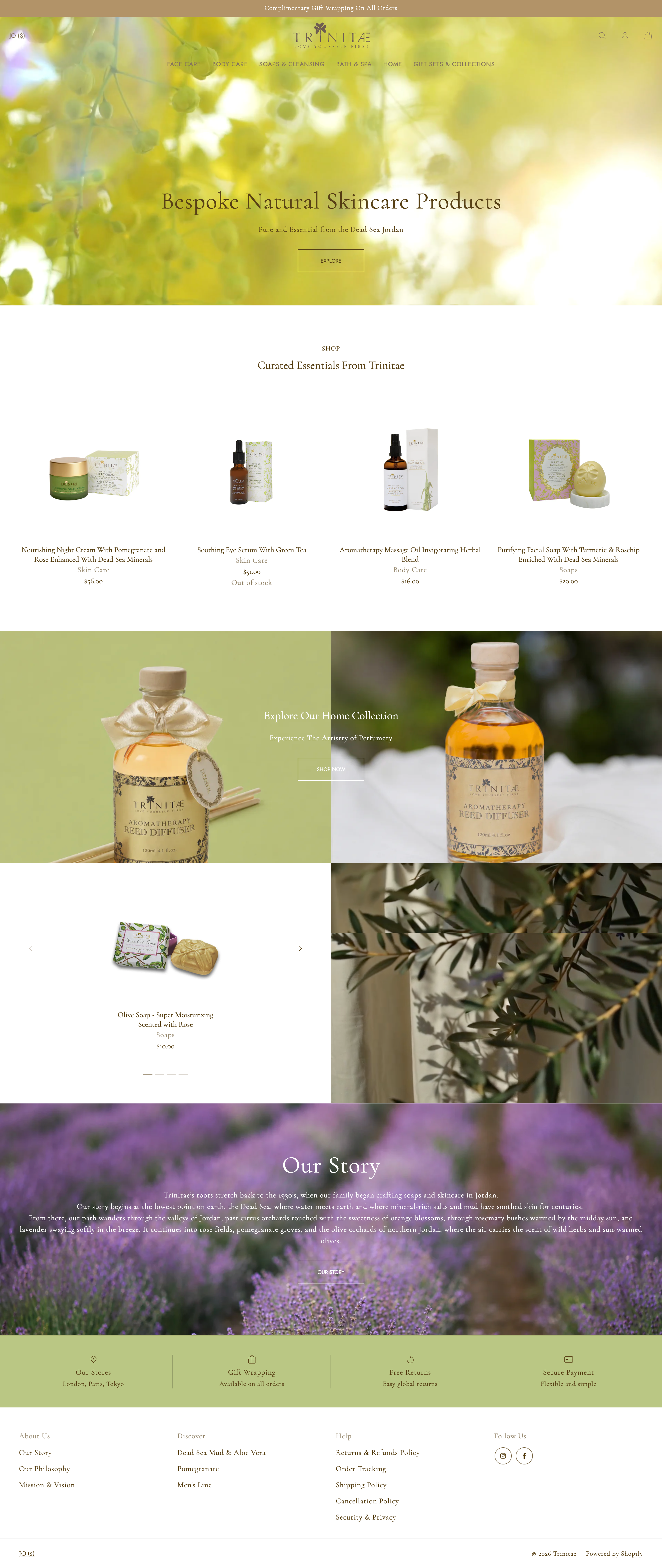
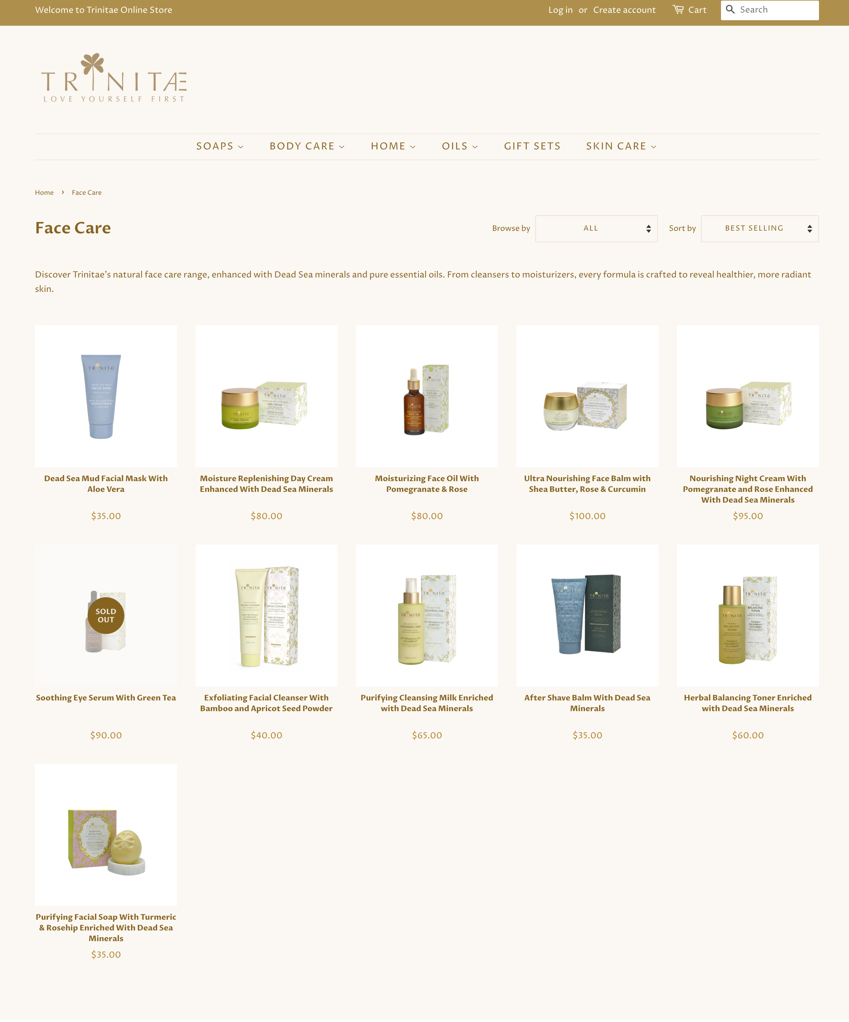
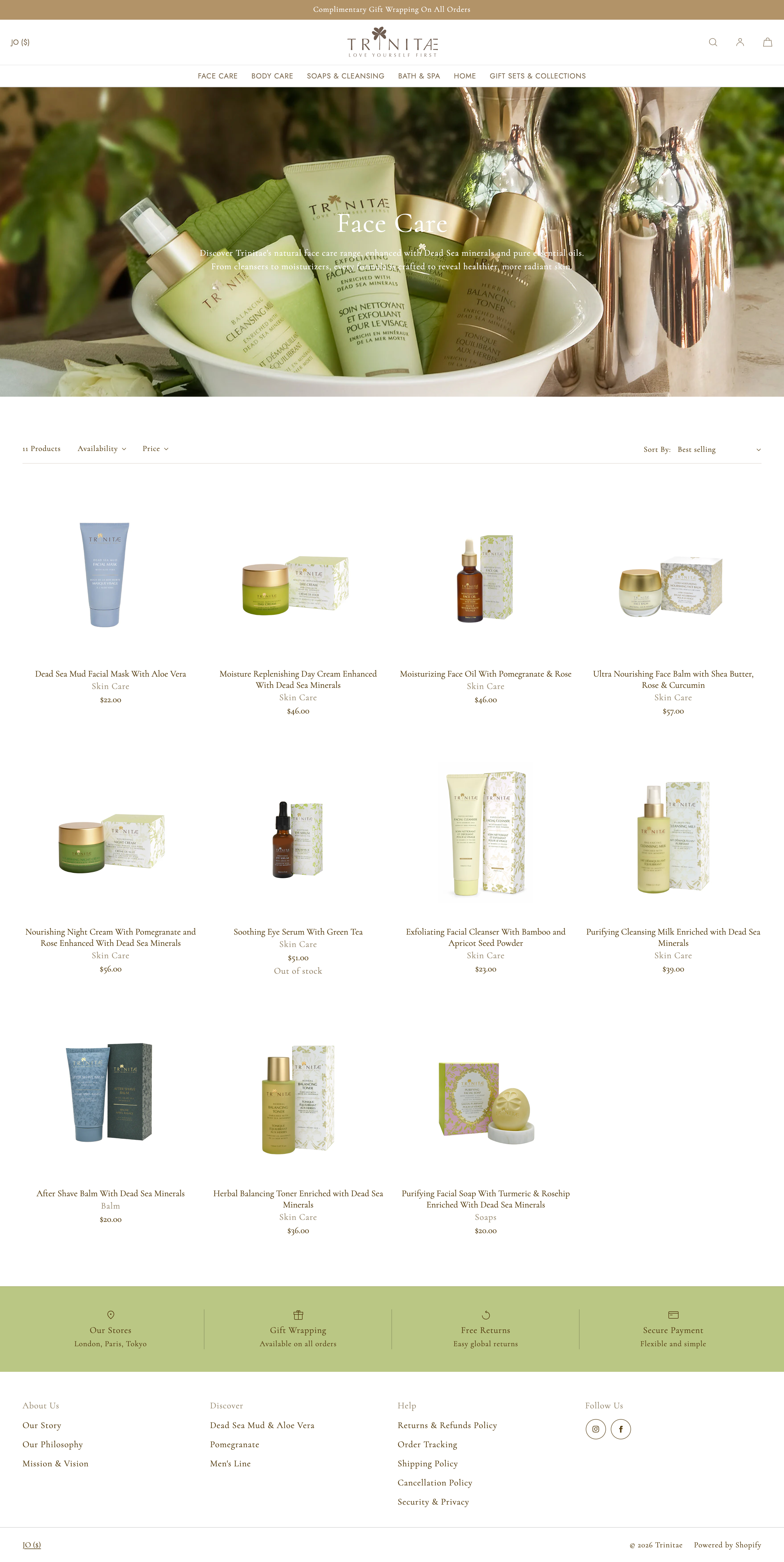
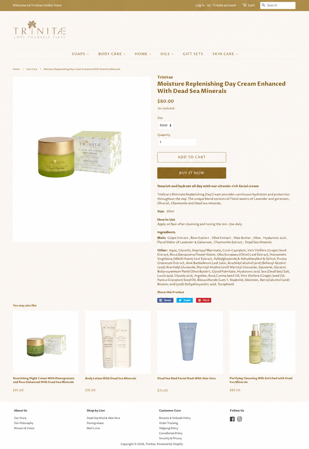
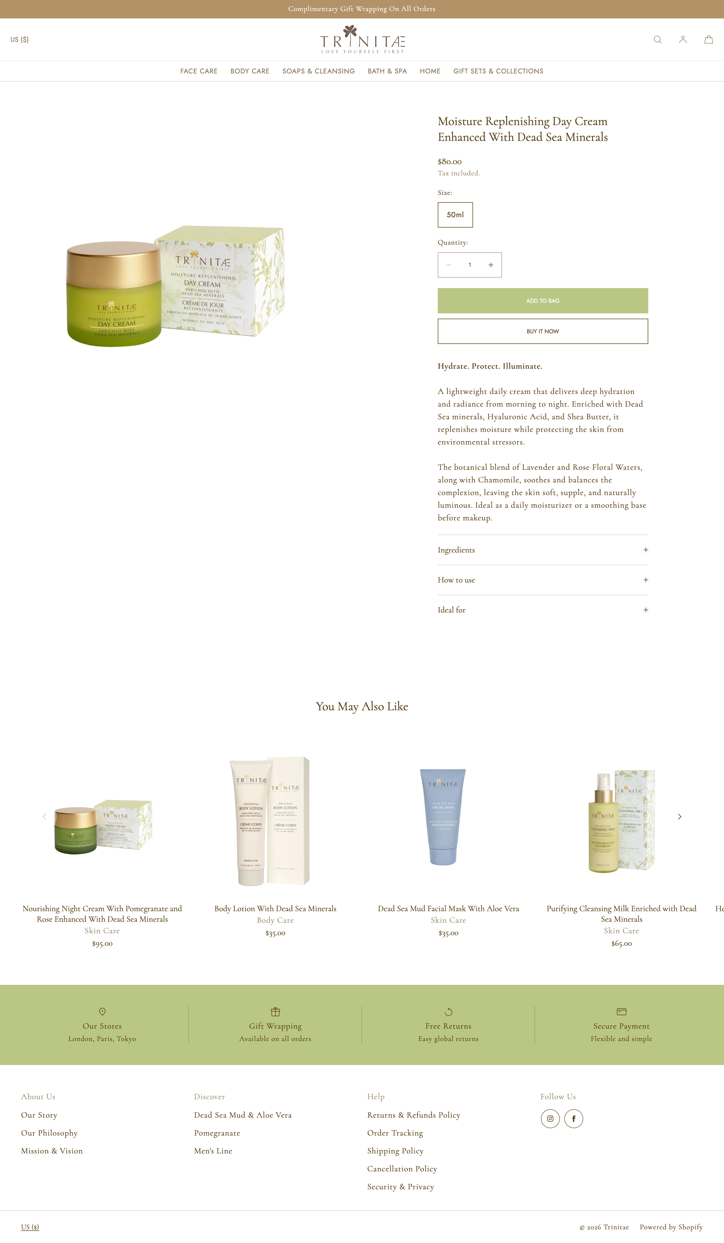
Trinitae's Shopify storefront had been running on the same theme for six years — a discontinued theme that predated Shopify 2.0 and had quietly accumulated limitations that were holding the brand back. Outdated product descriptions, inconsistently sized images, a navigation structure that didn't reflect the brand's actual product lines, and a visual experience that had drifted far from the identity defined in the brand guidelines.

This project was a full website overhaul: new theme, new IA, 165+ rewritten product descriptions, a complete image audit and resize, and a content system aligned with the brand guidelines I had built in parallel. It also required sustained stakeholder management — building the case for change with a team that had lived with the old site for years.

165+ Product descriptions rewritten
6 Years on a discontinued theme
2.0 Shopify version — migrated from legacy

Project status

The redesigned site is live. Content migration, image reshoots, and navigation restructure are complete. Additional optimizations are ongoing.

A site that no longer reflected the brand.

The old site wasn't broken — it just hadn't kept pace with where the brand had grown. Six years of product additions, price changes, and new collections had been layered onto a foundation that was never designed to scale. The result was a storefront that felt disconnected from the premium, nature-rooted identity Trinitae had built.

Before
Old Trinitae homepage
After
New Trinitae homepage

01

Discontinued theme

The site was running on a legacy Shopify theme that had been discontinued — meaning no updates, no Shopify 2.0 features, and a growing list of things the team simply couldn't do.

02

Outdated content

Many product descriptions were wrong, out of date, or inconsistent with the brand voice. Ingredient lists didn't match current formulas. Benefit claims varied between products.

03

Navigation mismatch

The navigation structure reflected how the site had been built over time, not how customers shopped. Categories were inconsistent and didn't align with the brand's actual product lines.

04

Image inconsistency

Product images were different sizes, shot in different styles, and scaled inconsistently across the storefront — undermining the premium visual experience the brand deserved.

05

Brand-site disconnect

The site didn't reflect the brand guidelines being developed in parallel. Typography, tone, and content structure all needed to be brought into alignment.

06

Getting buy-in

Perhaps the hardest challenge: building the case for change with a team deeply familiar with the existing site. The work required sustained stakeholder engagement, evidence-based proposals, and careful expectation management throughout.

Build the case. Then build the site.

01 Audit

Full content audit: product descriptions, ingredient lists, navigation labels, image inventory, and SEO metadata.

02 Stakeholder alignment

Theme research, comparison proposals, and iterative review sessions to build consensus on the new direction.

03 Content & IA

Navigation restructure, 165+ product description rewrites, ingredient standardization, and copy aligned to brand guidelines.

04 Build & launch

Shopify 2.0 theme implementation, image audit and resize, product page structure, and phased content migration.

The hardest part

Getting to yes before a single pixel changed.

A site that had worked for six years is a hard thing to move away from. My approach was to frame the conversation around what the team was missing — not what was wrong. That meant:

  • Documenting the specific Shopify 2.0 features unavailable on the legacy theme and what they would unlock
  • Researching and presenting multiple theme options with detailed comparisons, then narrowing through collaborative review
  • Making the change feel incremental and reversible, not a wholesale replacement of something familiar
  • Tying every decision back to the brand guidelines we had developed together — so the redesign felt like a natural extension of work already in progress

From how it was built to how customers shop.

The old navigation had grown organically over six years, resulting in a structure that reflected the order products were added rather than how customers thought about their needs. The new navigation was restructured around customer intent — organized by skin concern and product category, with labels that matched the brand's preferred terminology from the guidelines.

Before — Collections
Old collections page
After — Collections
New collections page

165+ descriptions. One voice.

Every product description was rewritten from scratch — not just updated, but rebuilt using the brand's voice framework, preferred terms glossary, and product tone profiles defined in the brand guidelines. Each description follows a consistent structure: a lead benefit statement, a sensory product narrative, and an ingredients and directions section.

Ingredient lists were audited against current formulas and standardized to INCI format. Benefit claims were aligned across product lines to avoid inconsistencies. The result is a content system that any team member or partner can extend as new products are added.

Before — Product page
Old product page
After — Product page
New product page

Content

165+ rewrites

Every product description rewritten using the brand voice framework — sensory, warm, grounded, and aligned to the preferred terms glossary.

Structure

Consistent page architecture

New product page structure with expandable Ingredients, How to Use, and Ideal For sections — clean, scalable, and on-brand.

Visuals

Image standardization

All product images audited, resized to consistent dimensions, and some reshot — creating a unified visual experience across the full catalogue.

A storefront that finally matches the brand.

The redesigned Trinitae storefront is live on Shopify 2.0 — with a visual experience, navigation structure, and content system that reflect the brand's identity for the first time. The brand guidelines and the website now speak the same language.

The new theme unlocks Shopify 2.0 features the team had been unable to access for years. The content system is scalable — as new products are added, the structure, tone, and terminology are all defined. And the stakeholder relationship, built carefully through the buy-in process, is stronger for having gone through the change together.

Reflection

The 165 product descriptions were the visible part of this project. The harder work was invisible — building enough trust and shared understanding that the team felt confident making a change they'd been hesitant about for years. Getting to yes is a design problem too. And the answer, as always, is in the details: evidence, patience, and making the unfamiliar feel safe.