All work

Case study

Trinitae
Brand Guidelines

Role Lead Service Designer
Company Trinitae Cosmetics
Industry Luxury Skincare
Focus Brand Strategy · Voice · Visual Identity · Content
Trinitae Brand Guidelines

A brand rooted in Jordan — built to scale.

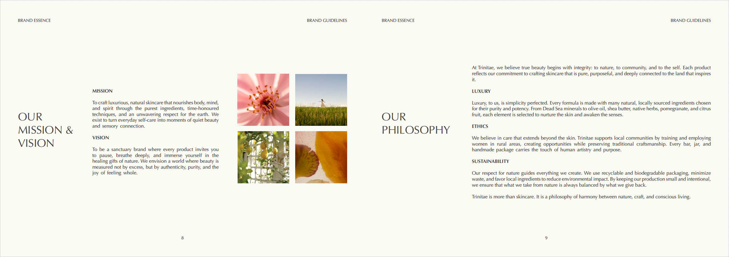
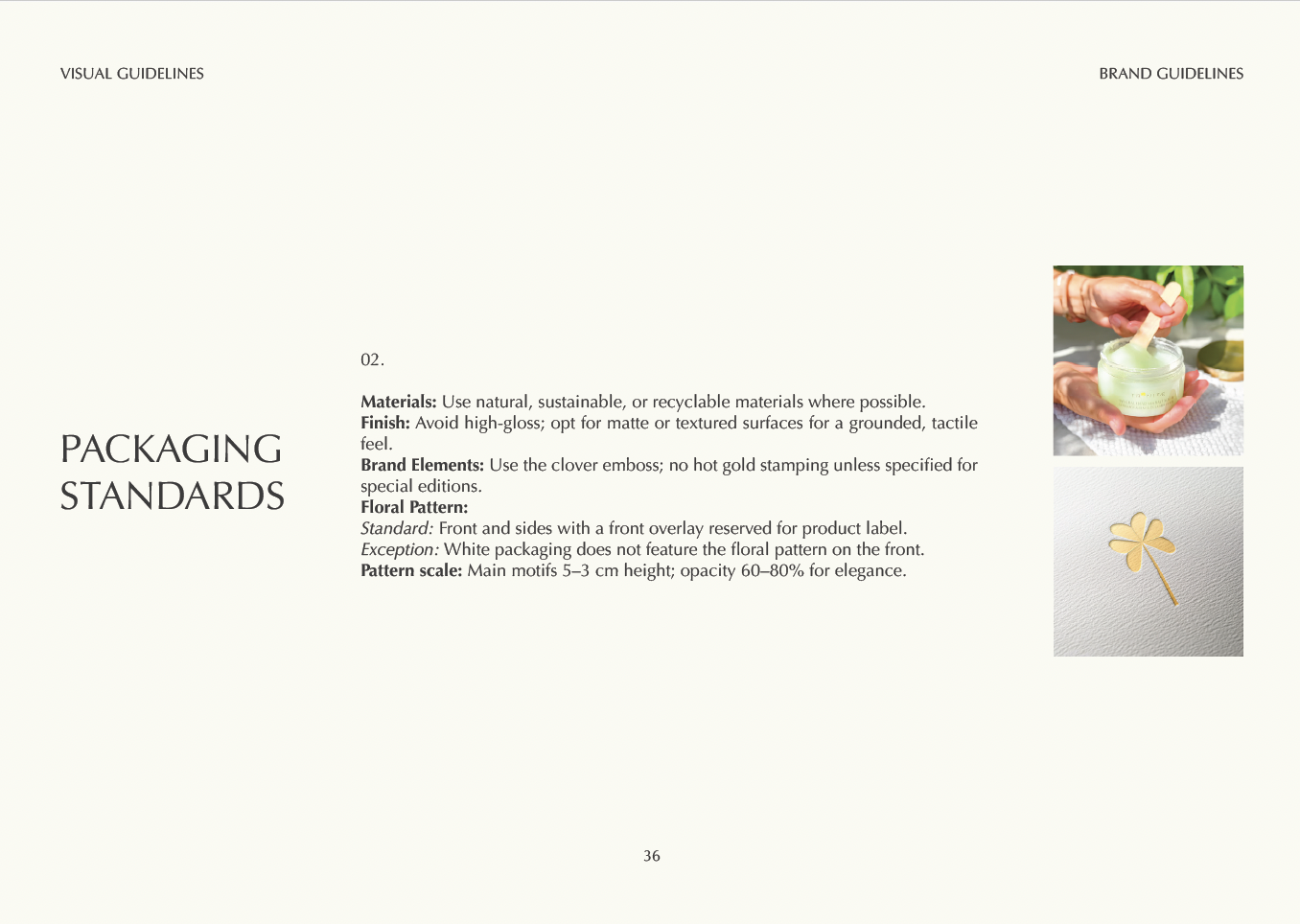
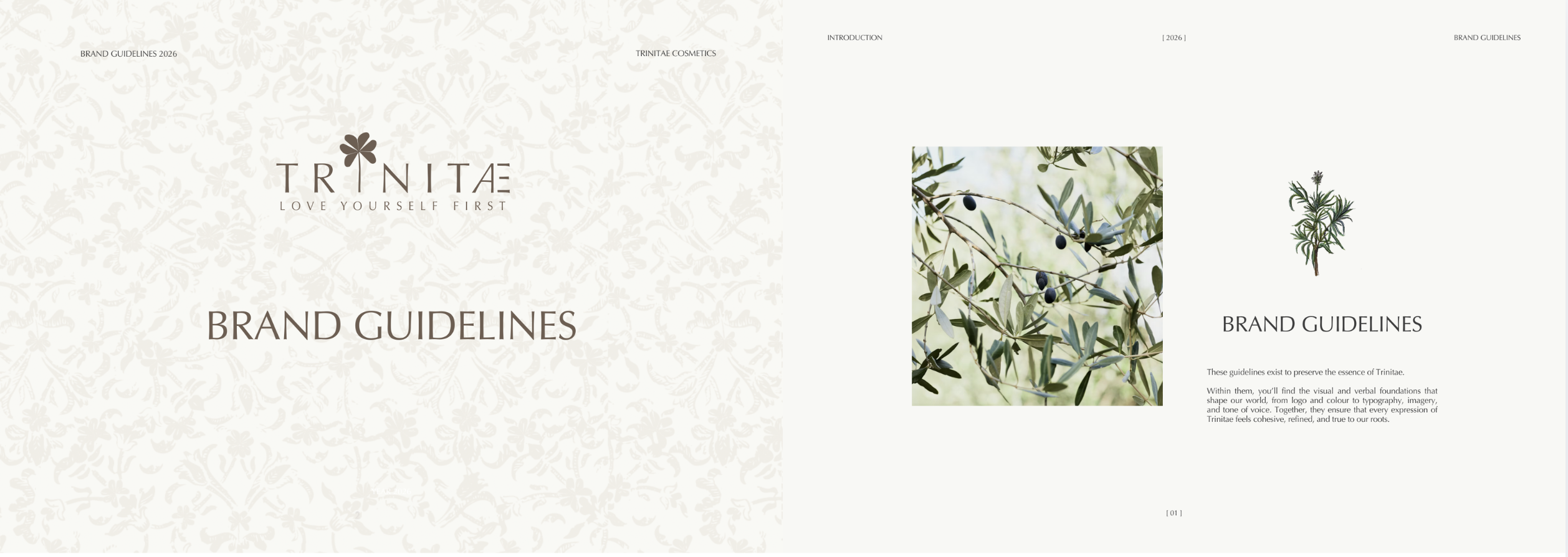
Trinitae Cosmetics is a luxury skincare brand whose roots stretch back to the 1930s, when the family began crafting soaps and skincare in Jordan. Today, the brand draws its identity from the landscapes of the region — Dead Sea minerals, olive orchards, rose fields, lavender, and pomegranate groves — translating centuries of natural tradition into a modern skincare experience.

As Trinitae began scaling — onboarding resellers and retail partners across new markets — the absence of centralized brand guidelines became a growing problem. Partners had no shared reference for how to represent the brand, leading to inconsistent visual execution, off-brand copy, and fragmented customer experiences across touchpoints.

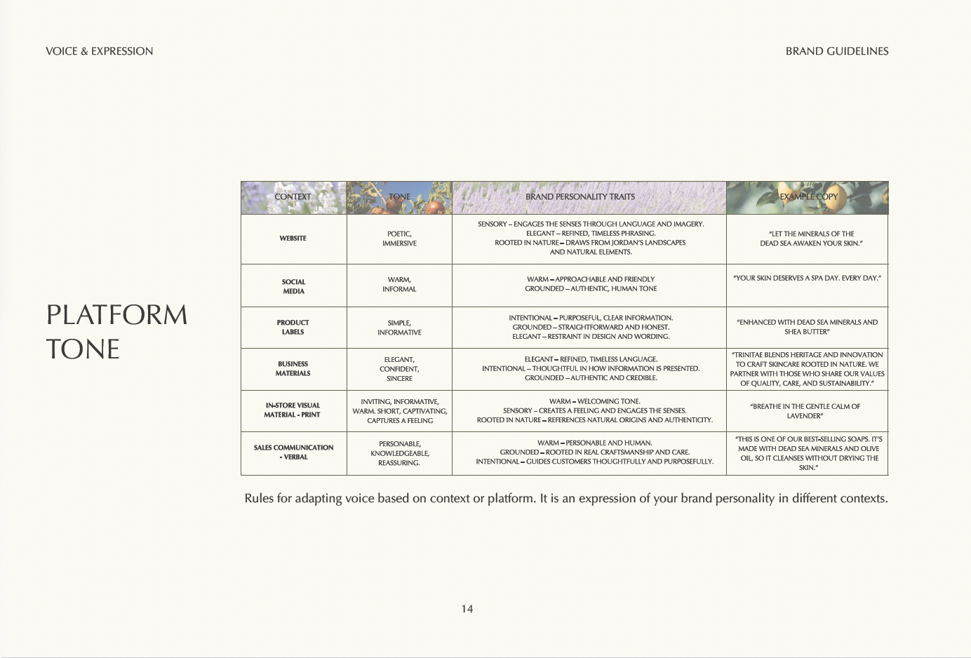
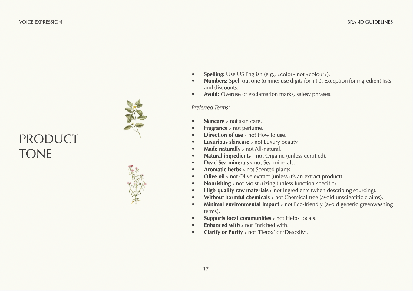
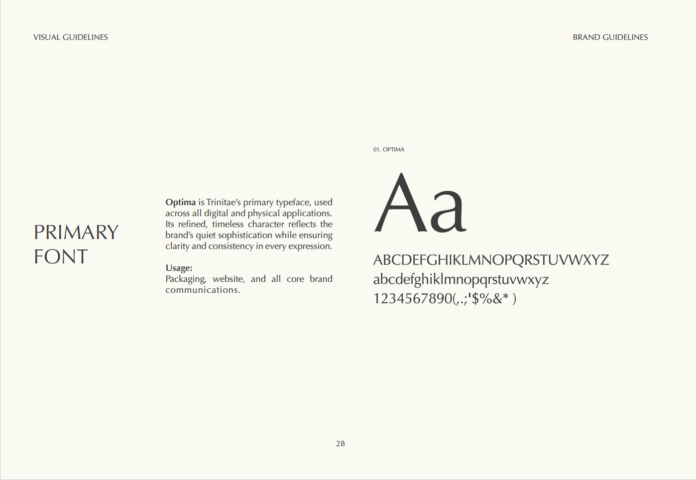
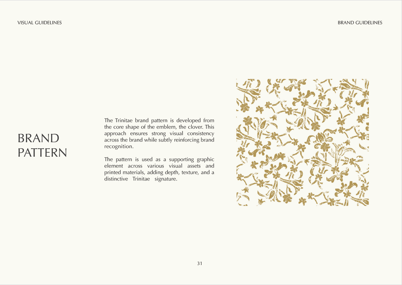
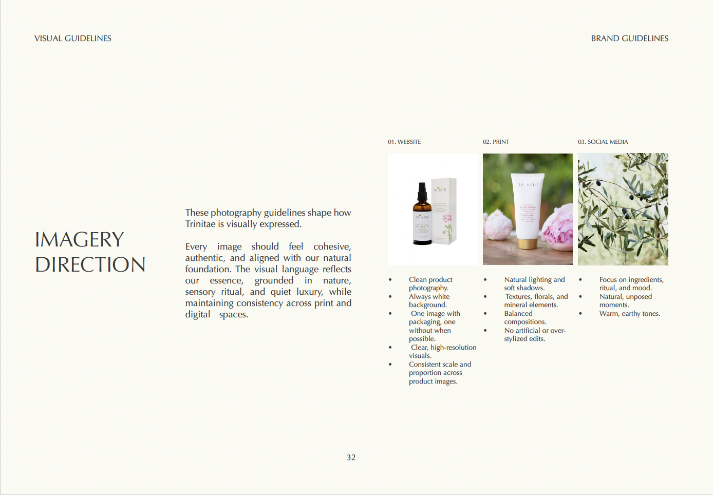
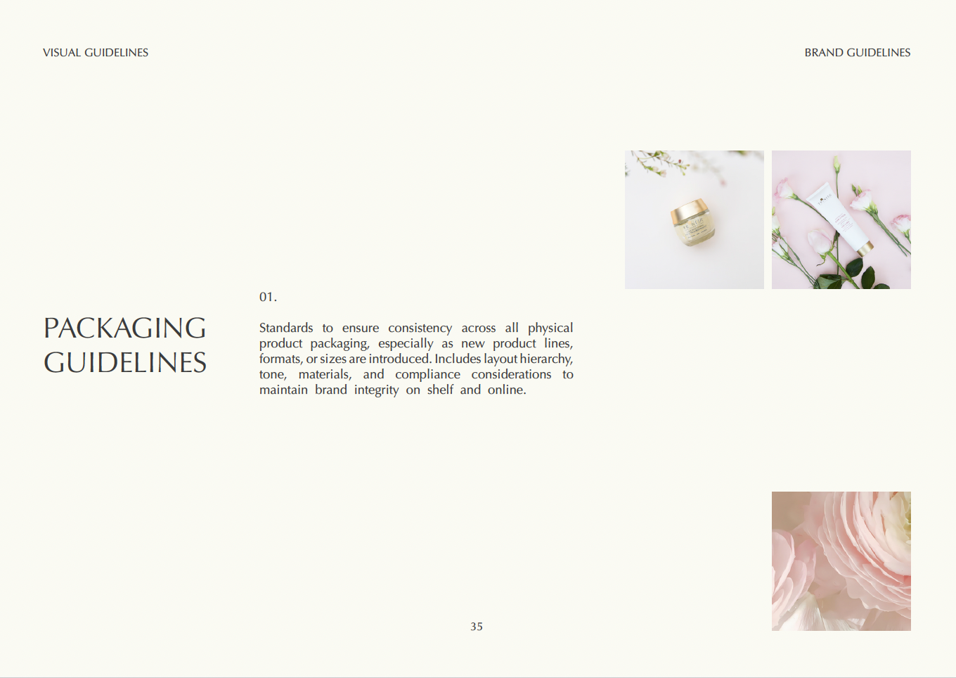
My role was to build the brand from the ground up as a codified system: defining the brand essence, voice, visual identity, packaging standards, and content guidelines into a single source of truth that could scale with the business.

Project status

The Brand Guidelines book is complete and in final review. A brand kit for partners and resellers is currently in production. Selected sections are featured in this case study.

Scaling without a shared language.

Without a centralized brand guidelines document, every reseller, retailer, and collaborator was effectively building their own version of Trinitae. Some used the wrong colors. Others wrote product copy that didn't match the brand's tone. Packaging varied. The brand voice — which should feel warm, grounded, and quietly luxurious — was being diluted by inconsistency.

The challenge wasn't just visual. It was systemic. Trinitae needed a framework that any partner could pick up and use — that defined not just what the brand looks like, but what it sounds like, how it moves through the world, and what it stands for.

01

No brand reference

Resellers had no single document to reference. Each partner interpreted the brand independently, creating fragmented visual and verbal execution across markets.

02

Inconsistent copy

Product descriptions, benefit claims, and tone varied wildly between touchpoints. Terms like "organic," "eco-friendly," and "detox" were being used without the brand's preferred language framework.

03

Visual drift

Without logo usage rules, clear space guidelines, or color standards, the brand's visual identity was being applied inconsistently — undermining the premium positioning Trinitae had built.

04

Packaging variance

New product lines and formats were being introduced without consistent packaging standards — creating shelf inconsistency and compliance risks in new markets.

05

No scalable system

There was no framework for onboarding new partners, launching new lines, or expanding into new markets while maintaining brand integrity.

06

Digital-physical gap

What customers saw on the website often didn't match what they received in hand. Product names, ingredient claims, and benefit descriptions needed to be unified across both.

Everything begins with the story.

Before any visual or content guidelines could be written, the brand needed a clear articulation of what it is, what it believes, and how it wants to make people feel. The brand essence section of the guidelines established this foundation — anchoring every subsequent decision in a shared understanding of Trinitae's identity.

Brand story

"Our story begins at the lowest point on earth, the Dead Sea, where water meets earth and where mineral-rich salts and mud have soothed skin for centuries."

Mission

To craft luxurious, natural skincare that nourishes body, mind, and spirit — turning everyday self-care into moments of quiet beauty and sensory connection.

Vision

To be a sanctuary brand where every product invites you to pause and immerse yourself in the healing gifts of nature. Beauty measured by authenticity, purity, and the joy of feeling whole.

Philosophy

Luxury is simplicity perfected. Ethics extend beyond the skin — supporting local communities, training women in rural areas, preserving traditional craftsmanship. Sustainability as responsibility, not marketing.

Brand essence spreads

Six traits. One voice.

The personality traits define how Trinitae communicates in every context — from product labels to social media to partner communications. They give everyone who writes or speaks for the brand a shared compass.

Warm

Friendly, human, and approachable without being overly casual or chirpy.

Grounded

Down-to-earth, authentic, and rooted in real craftsmanship and care.

Sensory

Immersive and calming — engages the senses through texture, scent, and ritual.

Elegant

Refined and timeless, never flashy or overly decorative. Beauty in restraint.

Intentional

Thoughtful and purposeful in every detail, from ingredient to language.

Rooted in nature

Connected to the land, traditions, and natural materials of Jordan. Never synthetic or disconnected.

Words that hold the brand together.

One of the most important outputs of the brand guidelines was the voice and content framework — a practical system for how Trinitae writes, regardless of who is doing the writing. This included platform tone profiles, product line tone by category, and a preferred terms glossary that defined the exact language the brand uses and avoids.

The preferred terms list was particularly important: it replaced vague or legally risky language ("chemical-free," "eco-friendly," "detox") with precise, authentic alternatives that reflect both the brand's values and regulatory best practice.

Platform tone profiles table
Preferred terms & content guidelines

A system grounded in nature.

The visual guidelines established the rules for how Trinitae looks across every surface — digital, print, and packaging. Logo usage, clear space, color palette, typography, brand pattern, and imagery direction were all codified for the first time into a single reference that any partner or team member could follow.

Earthy tones, soft accents.

Trinitae Green inspiration

Trinitae Green

Pantone 7492 U — primary

Cool Grey inspiration

Cool Grey

Pantone 11 U — primary

Pantone Gold inspiration

Pantone Gold

Pantone 872 U — primary

Secondary colors are inspired by Trinitae's product lines — soft rose for the Rose line, lavender for the Lavender line, mineral blue for the Mud line, and deep pomegranate red for the Men's line. Each product category has a visual identity that traces back to its key ingredient.

Primary logo + emblem usage rules
Optima + Signarita Zhai typefaces
Clover-derived brand pattern
Photography guidelines

From the shelf to the skin.

The packaging section was one of the most detailed — and most necessary — parts of the guidelines. It defined materials, finish standards, floral pattern usage, logo placement, front and back of pack content hierarchy, language order, regulatory compliance requirements, and gift box specifications.

A website alignment section ensured that what customers see digitally mirrors what they receive physically — with tone consistency rules and a recommended content flow that keeps ingredient claims and benefit descriptions identical across all surfaces.

Packaging standards
Front & back of pack content hierarchy
Inner leaflet — multi-language layout

One document. Every surface.

The Brand Guidelines book consolidates the full Trinitae identity into a single reference document — covering brand essence, voice and content standards, visual identity, packaging, and digital-physical alignment across 33 pages.

For the first time, any reseller, partner, or team member can open a single document and know exactly how to represent the brand: what words to use, what colors to apply, how to size the logo, how to write a product description, and how packaging content should flow from front to back.

The brand kit for partners and resellers — a lighter, more accessible version designed for external use — is currently in production and will be distributed alongside the full guidelines book.

33

Pages

Full brand guidelines book covering brand essence through to print collateral standards.

6

Personality traits

A defined brand personality that any writer, designer, or partner can apply consistently across any context.

6+

Platform tone profiles

Context-specific tone guidance for website, social media, product labels, business materials, in-store, and sales.

20+

Preferred terms

A precise content glossary replacing vague or legally risky language with authentic, brand-aligned alternatives.

2

Color palettes

Primary brand colors plus a secondary palette that traces each product line back to its key natural ingredient.

In progress

Brand kit

A partner-facing brand kit currently in production — designed for resellers and collaborators to onboard quickly and represent the brand correctly.

Reflection

Building brand guidelines for a company scaling into new markets is a content design challenge as much as a visual one. Getting the voice right — finding language that honors the brand's heritage and values without feeling stiff or generic — required the same kind of upstream thinking I bring to any content system. The preferred terms list alone changed how the whole team writes. That's the kind of upstream work that compounds over time.