All work

Case study

Creative direction through
prompt engineering

Role Creative Direction · Brand Strategy · Prompt Engineering
Client The Workshop
Timeline 2026
Tools Claude · Claude Design
The Workshop — final brand identity direction, applied across signage, packaging, and merchandise

Most AI logos look like AI logos. This one shouldn't.

Most AI-generated logos look AI-generated — not because the models lack capability, but because they're given vague prompts and accepted too quickly. I wanted to see what happened if I approached AI the way I'd approach a design team: not a machine that produces answers, but a collaborator that needs direction, critique, and continuous refinement.

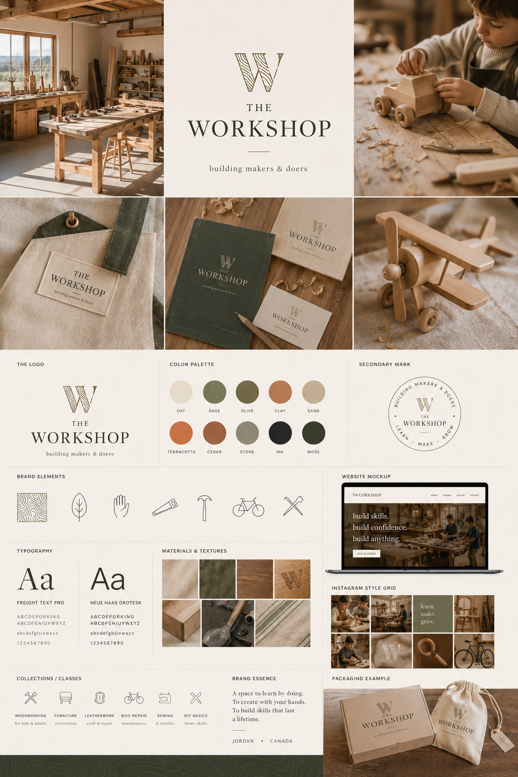
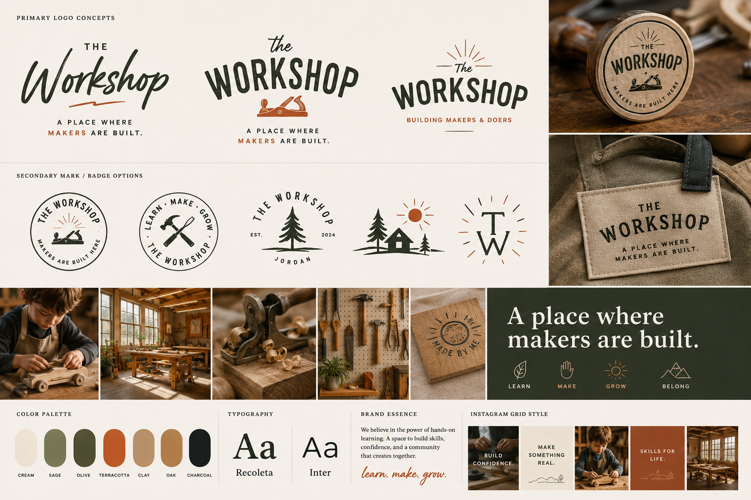
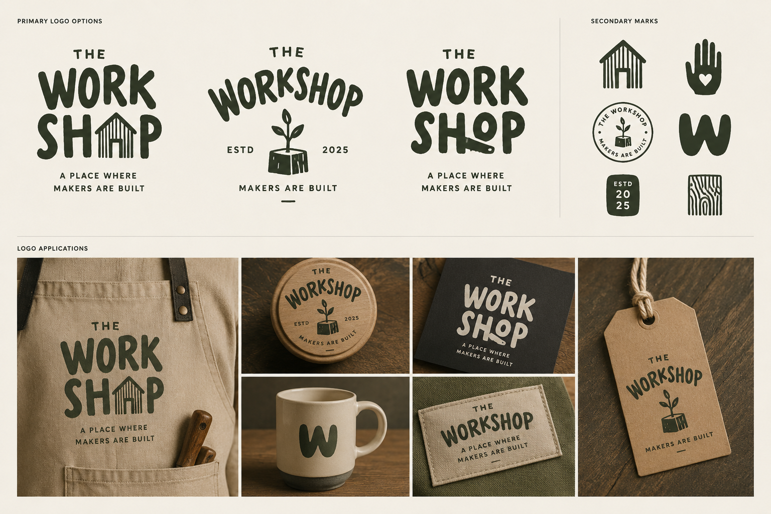
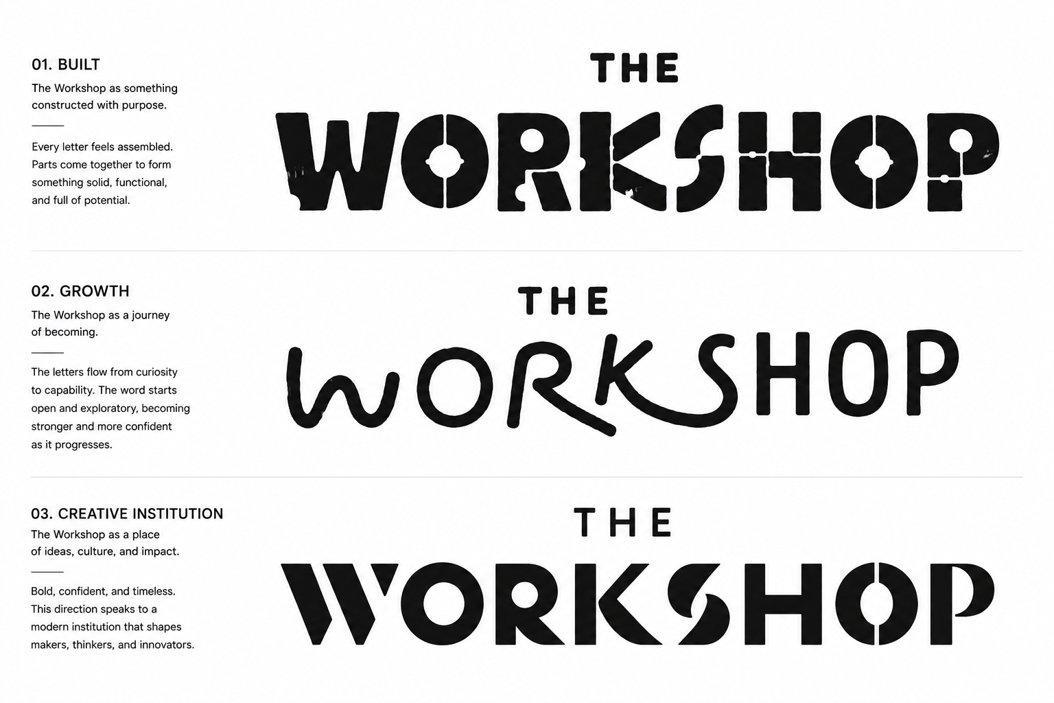
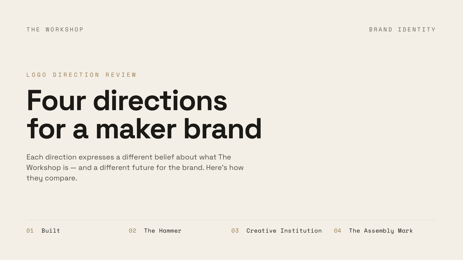
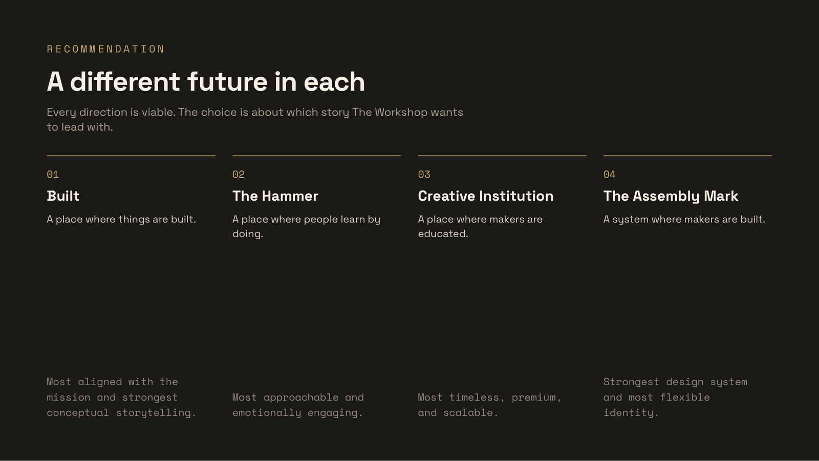
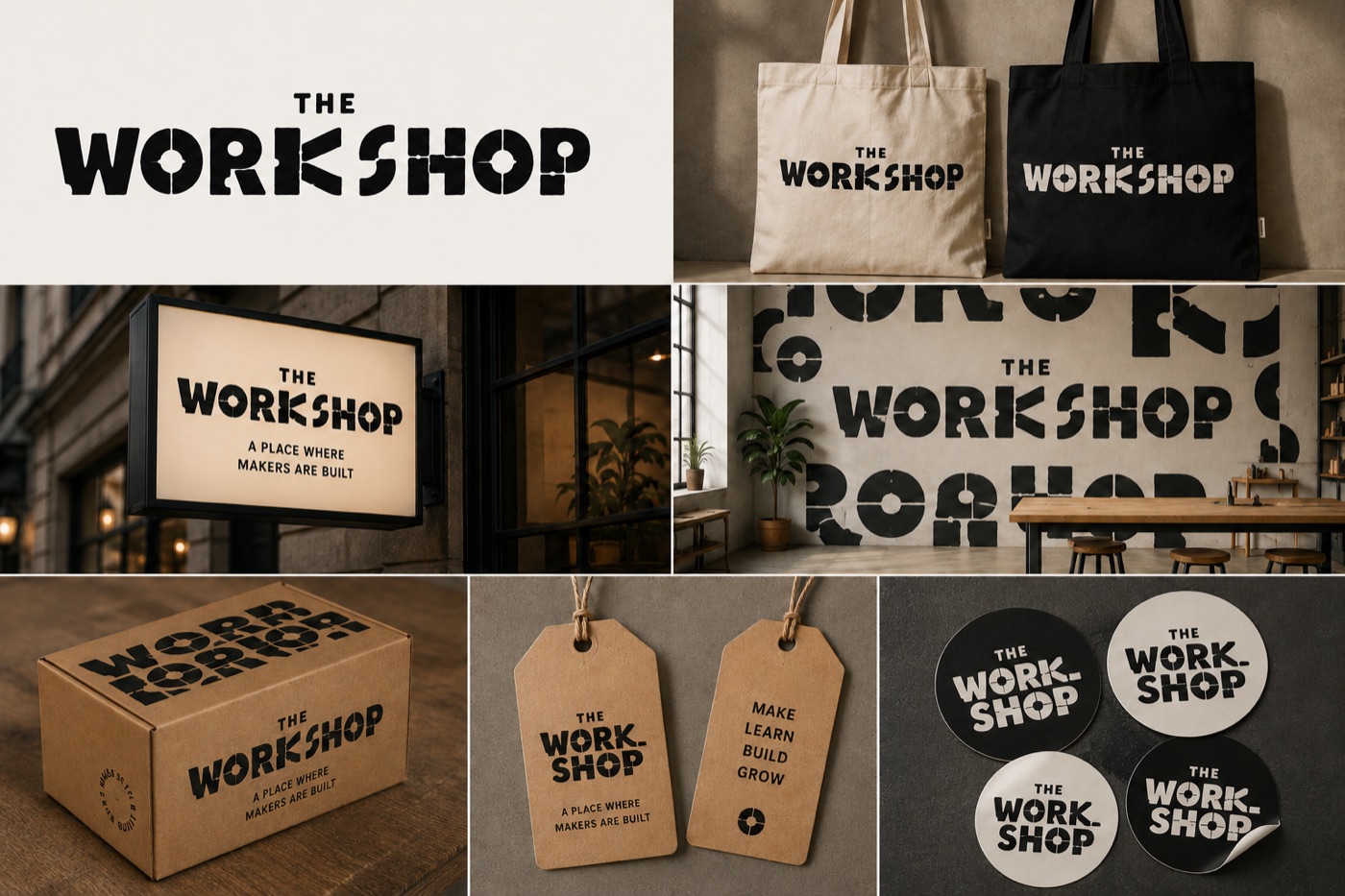
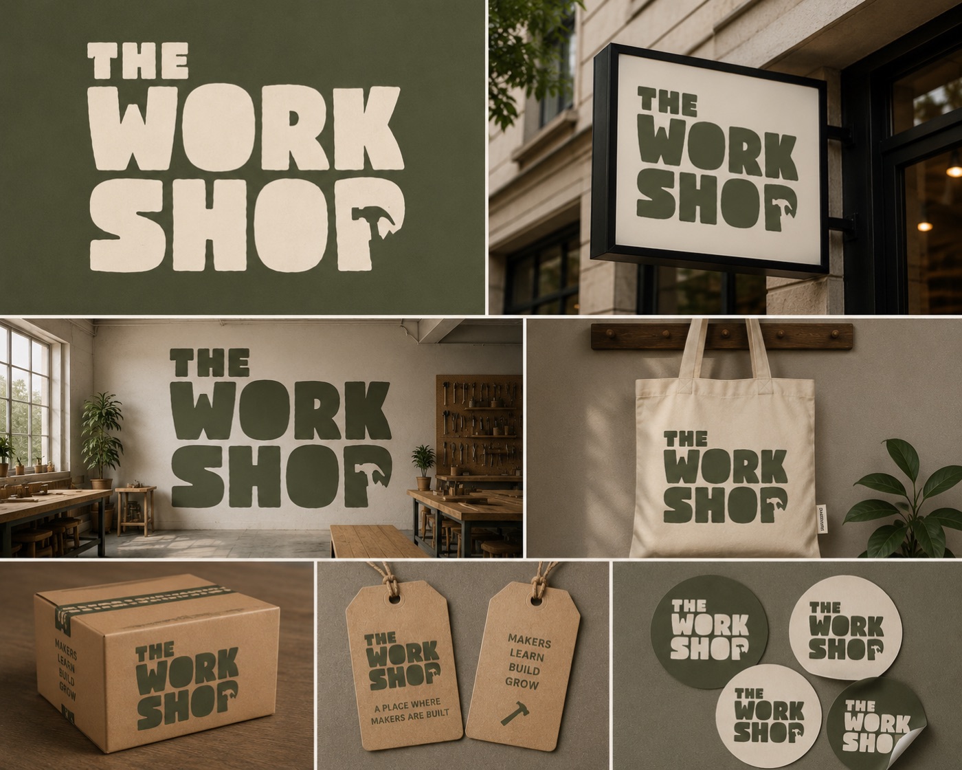
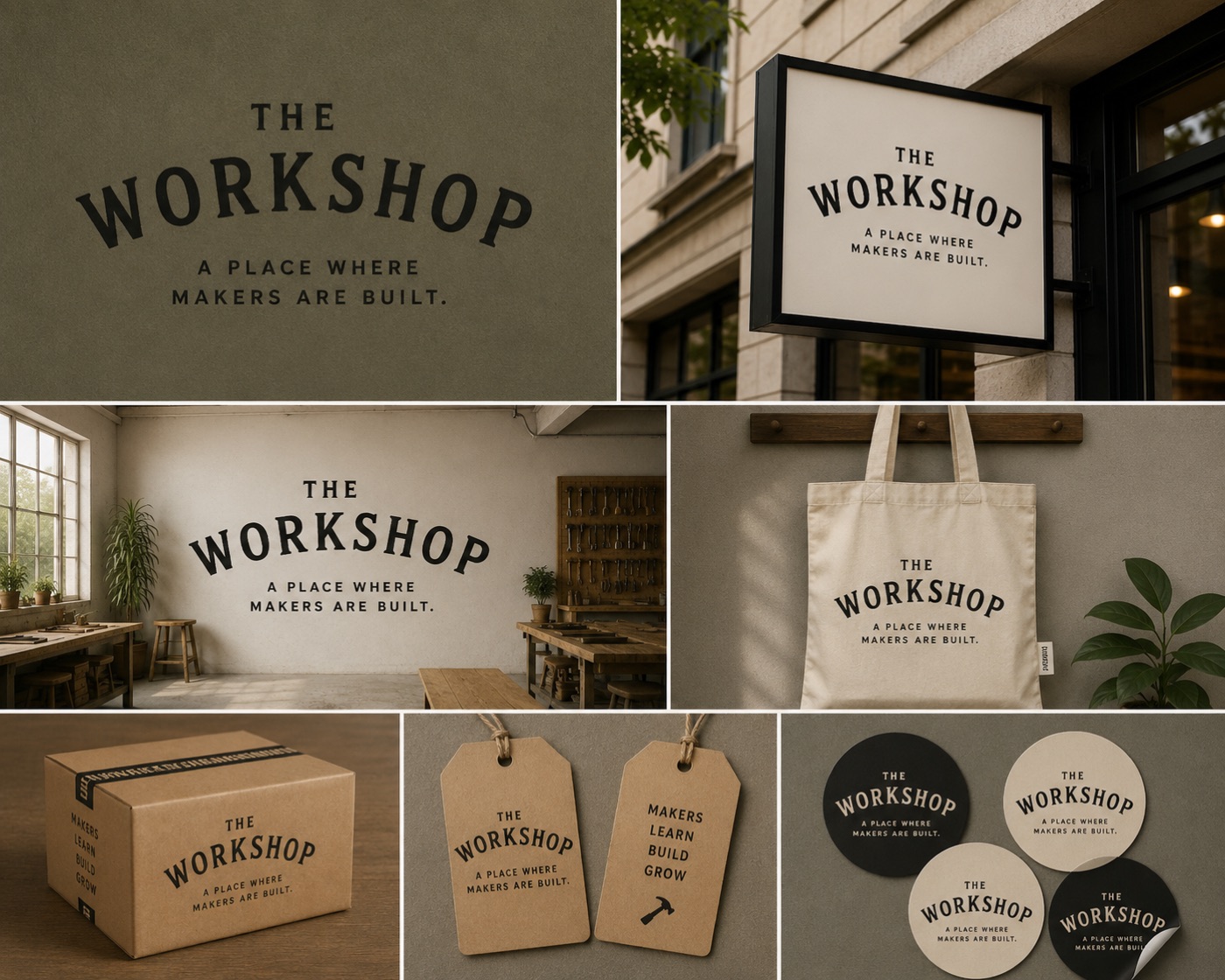
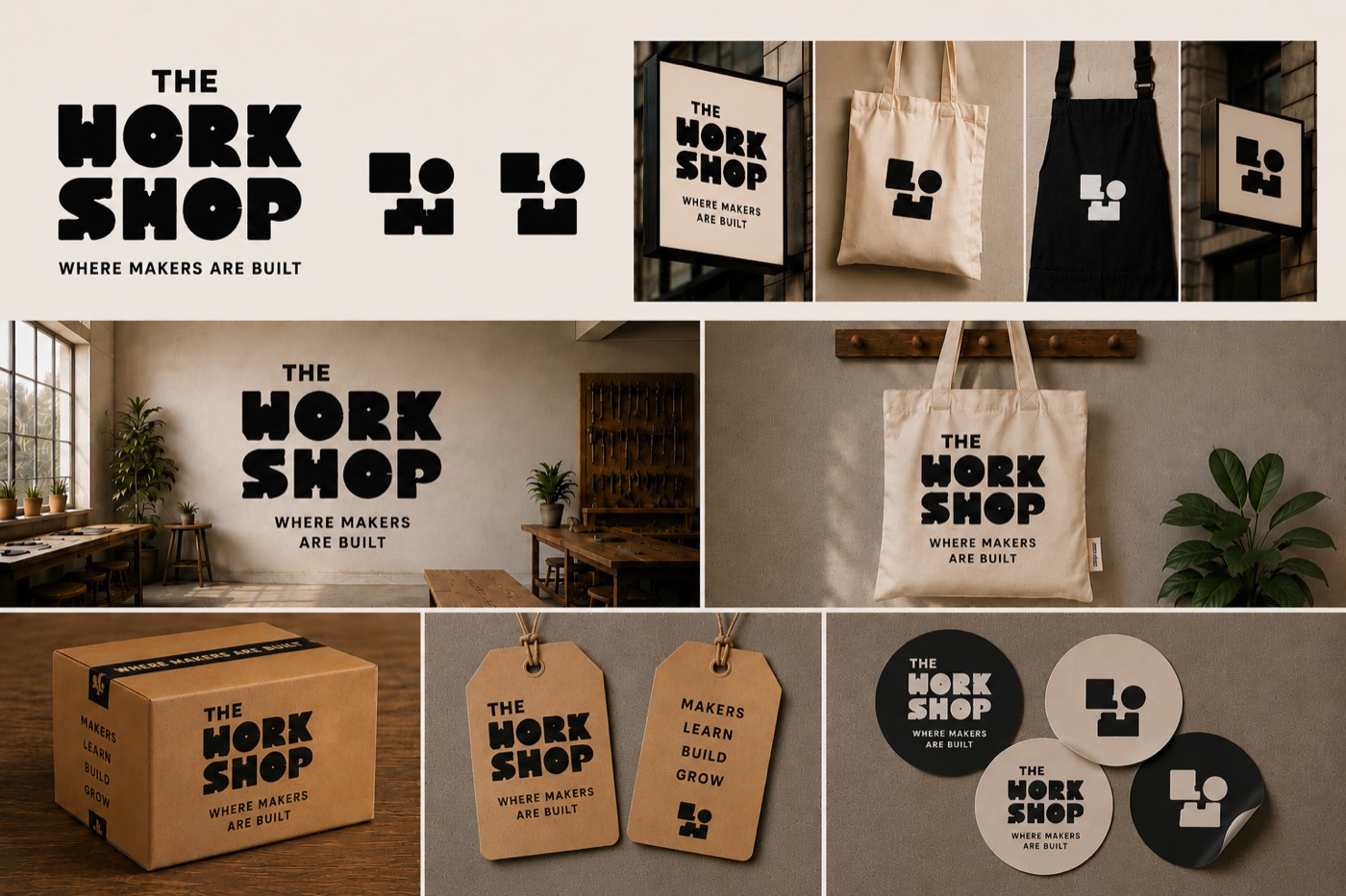
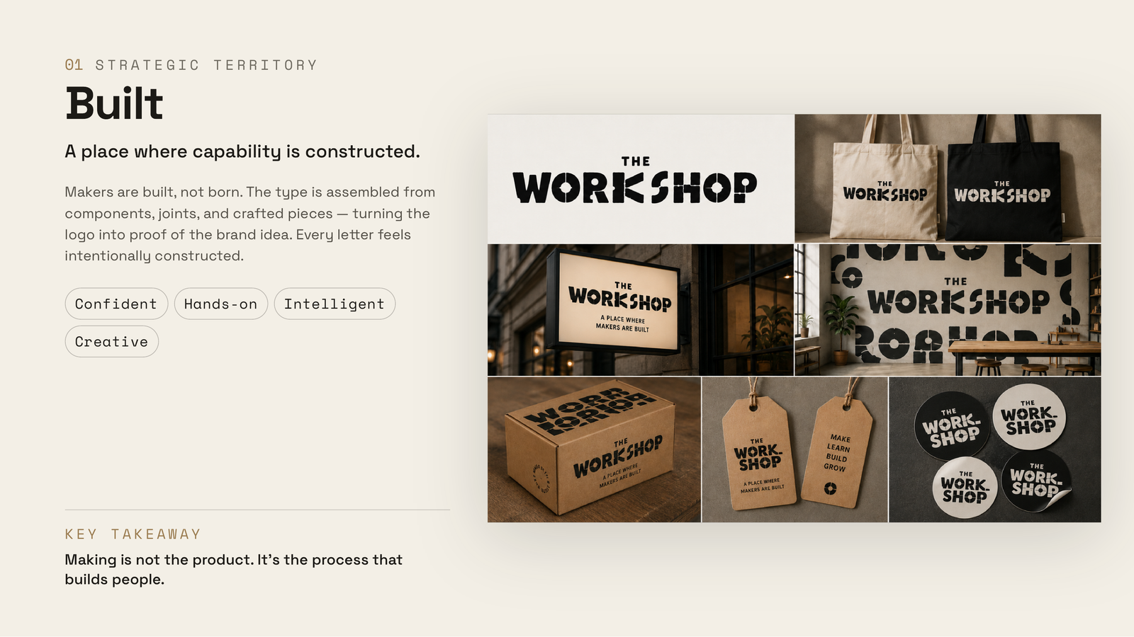
The result wasn't a logo generated in one prompt. It was a strategic identity system for The Workshop, shaped through hundreds of design decisions and presented as four distinct directions — each a different belief about what the brand could be.

18 Iteration rounds, literal to refined
4 Strategic directions presented
0 Tool clichés in the final work

Design transformation — not tools.

The Workshop isn't a woodshop. It isn't a hardware store. It isn't a maker space in the traditional sense. It's a modern learning environment where people become makers through experimentation, curiosity, and building.

So the challenge was designing an identity that communicated transformation, not equipment. Everything the model reaches for by default — hammers, gears, wrenches — pointed in exactly the wrong direction.

The brief the identity had to satisfy.

Before generating a single visual, I defined the principles the identity had to meet. These constraints became the foundation for every prompt that followed.

It had to feel

Intelligent, confident, human

Creative, timeless, systematic, and ownable. An identity with the credibility of an institution and the warmth of a place people actually want to build in.

It had to avoid

Every cliché of "making"

No hammers. No gears. No wrenches. No houses. No saw blades. No generic monograms. The obvious visual vocabulary was off the table from the start.

AI wasn't the designer. Creative direction was.

The shift

Treat the model like a junior designer, not a vending machine.

How that changed the work

  • Every prompt added more context, so each round got more specific
  • Every output was evaluated against the strategy, not accepted on sight
  • Instead of searching for a logo, I searched for stronger ideas
  • Language became the primary design tool — direction, not generation, drove the result

Strategy. Concepts. Critique. System.

01 Strategy
02 Concepts
03 Critique
04 System

Establishing strategic territory

The first prompts never mentioned typography. They focused entirely on strategy: brand archetype, emotional territory, cultural positioning, symbols to avoid, and what making actually means. Only once the strategy felt right did we begin exploring visual concepts.

Exploring conceptual directions

Rather than asking for random logo ideas, I directed the model to explore distinct strategic territories — Built, Assembly, Creative Institution, Becoming, The Maker's Path, and a Constructed Wordmark. Each represented a different interpretation of what "making" could mean.

Designing through critique

This was the longest phase. Instead of accepting outputs, I art-directed them — hundreds of micro-decisions that gradually shaped the identity.

Direction, one note at a time "Remove the standalone W."
"Make it feel less corporate."
"The typography feels too AI-generated."
"Push it toward Collective Forest."
"Remove every literal tool reference."
"Make it feel more like a cultural institution."
"Keep the concept. Start over."

Building a design system

The goal was never a logo — it was an identity. Once the typography felt right, I explored how it behaved across a whole ecosystem: signage, tote bags, studio graphics, packaging, tags, stickers, and secondary marks. Every iteration asked the same question: does this still feel like The Workshop?

From literal and rustic to ownable.

The clearest proof of the method is the distance between where it started and where it landed. Early rounds leaned on exactly the clichés the brief ruled out. Round by round, critique stripped them away until the identity became pure, confident typography.

Early — literal & rustic
Early brand exploration — rustic woodshop aesthetic with literal tool imagery
Iteration — still clichéd
Second round — hammers, trees, and sunbursts still present
Refinement — hand-drawn
Later round — playful hand-drawn wordmarks, fewer literal symbols
Final — pure typography
Final direction — three confident typographic wordmarks, no clichés

Prompt engineering is really asking better design questions.

The biggest lesson wasn't about writing better prompts. Each prompt got more specific because the strategy got more specific — the better I articulated the design intent, the better the outputs became. AI accelerated exploration; judgment determined the direction.

The most valuable skill wasn't prompting. It was knowing what to keep, what to reject, what to refine, and when to abandon a direction entirely. The role shifted from designer to creative director, with language as the primary design tool.

Four directions, presented as strategy.

I packaged the work as a strategic review rather than a single logo — four viable directions, each with its own belief about what The Workshop is and its own future for the brand. I built the presentation itself in Claude Design.

01

Built

A place where capability is constructed. Making is not the product — it's the process that builds people.

02

The Hammer

The spirit of hands-on making. Bold and welcoming: everyone can become a maker.

03

Creative Institution

The institution of making. Timeless and premium: a trusted place where makers are developed.

04

The Assembly Mark

Ideas assembled into capability. A modular system, built one piece at a time.

Presentation — overview
Presentation overview page introducing the four directions
Presentation — recommendation
Recommendation page comparing the four directions

AI didn't replace the design process. It expanded it.

Directed, not generated

A thoughtful, ownable identity that avoids every visual cliché — reached through structured iteration, not a lucky prompt.

Strategy, not decoration

Four distinct directions, each tied to a belief about the brand, packaged as a decision leadership could actually make.

A repeatable method

Strategy first, critique always, systems thinking throughout — a way of working with AI that scales to any brand.

Reflection

This project wasn't an experiment in generating logos. It was an experiment in creative direction — using language, systems thinking, and structured iteration to guide AI toward a thoughtful, ownable brand. The final outcome reflects not just what AI can create, but what human judgment can shape.

© 2026 JEEDA MASOUD UX & CONTENT DESIGNER THIS SITE IS LIVE. ALWAYS UPDATING. ALWAYS EVOLVING.