All work

Case study

TELUS Overview
Redesign

Role Senior Content Strategist
Company TELUS Digital
Industry Telecommunications
Focus IA · Content Hierarchy · UX Writing · Research
TELUS Overview Redesign

The gateway for 4.2 million customers — rebuilt from the ground up.

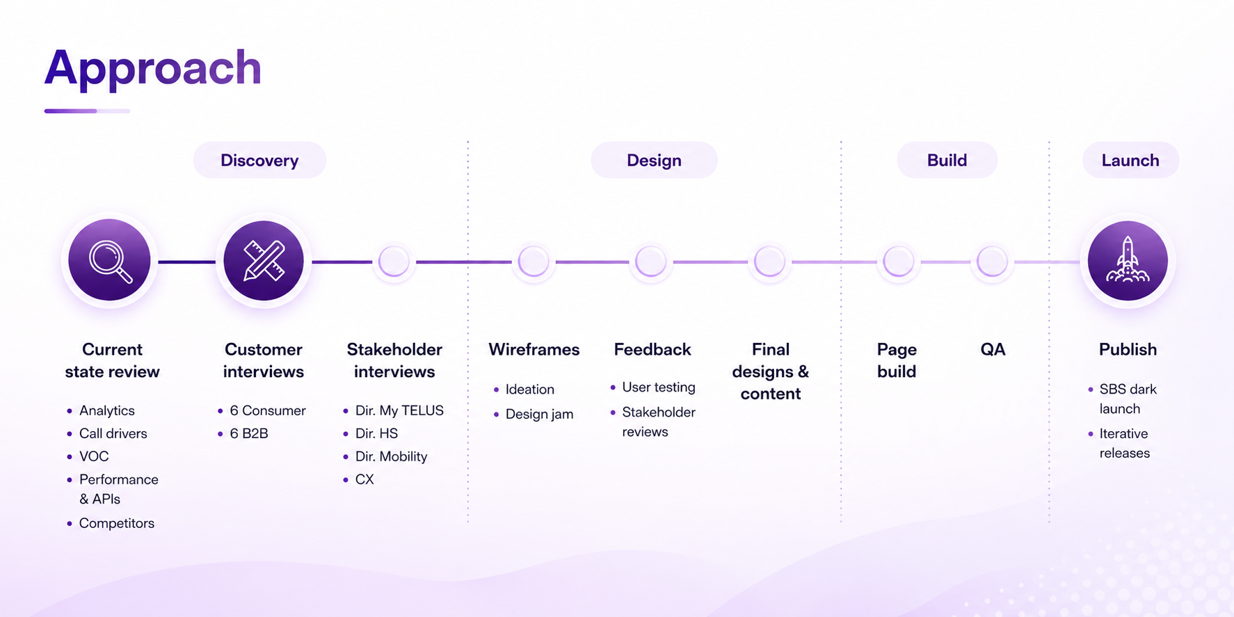
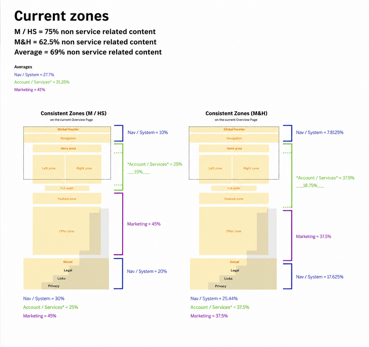
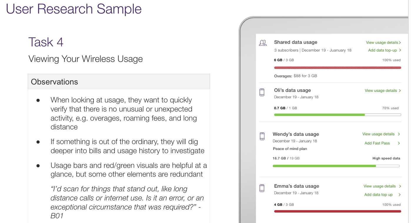
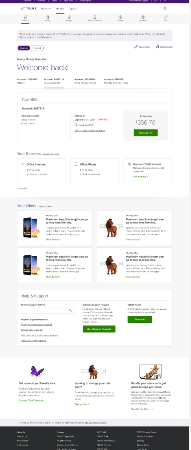
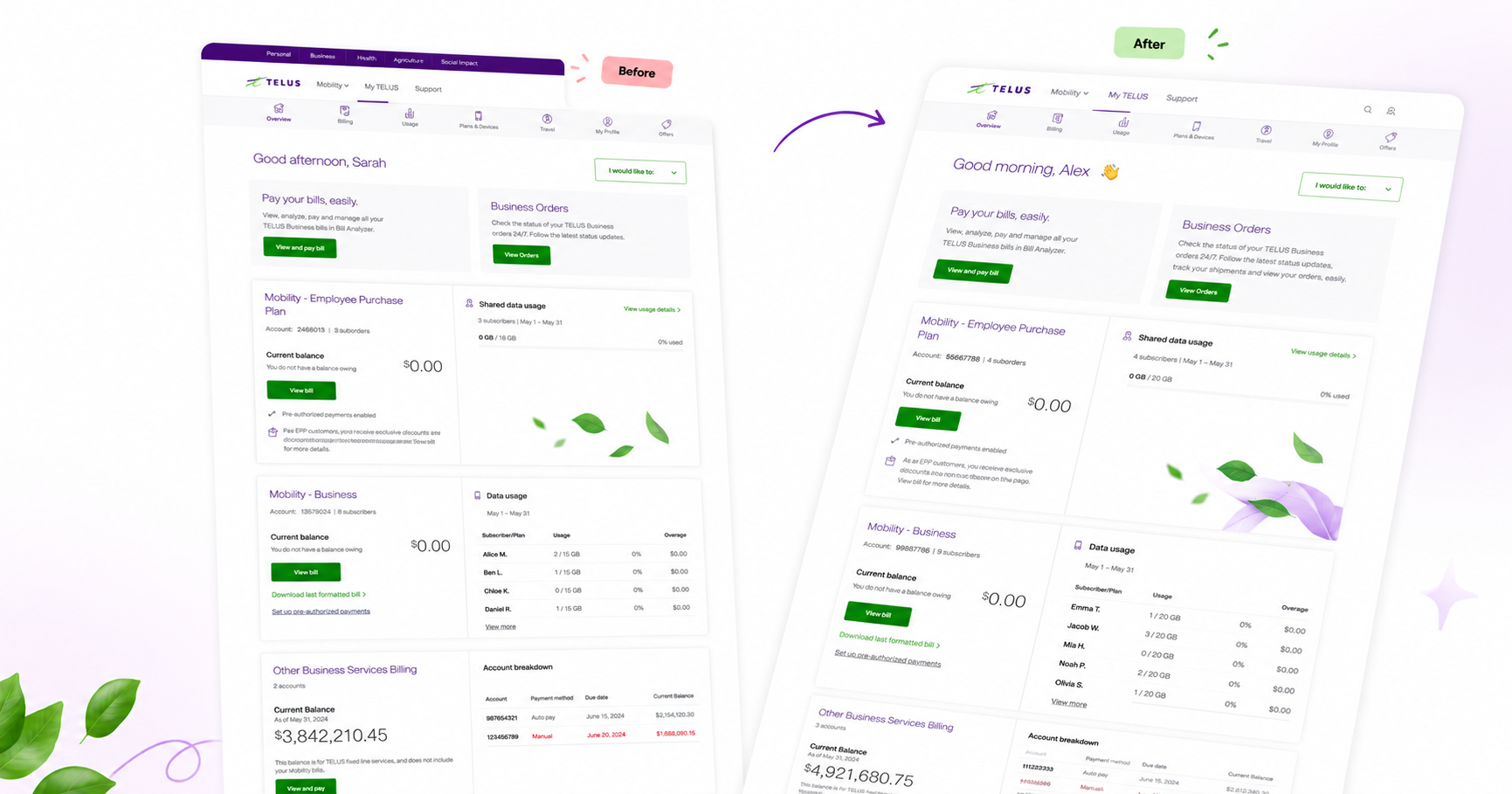
The My TELUS Overview page is the highest-traffic surface in the TELUS digital product — the first thing 4.2 million customers see when they log in to manage their telecommunications accounts. Over time it had become overloaded, slow, and harder to navigate than it needed to be.

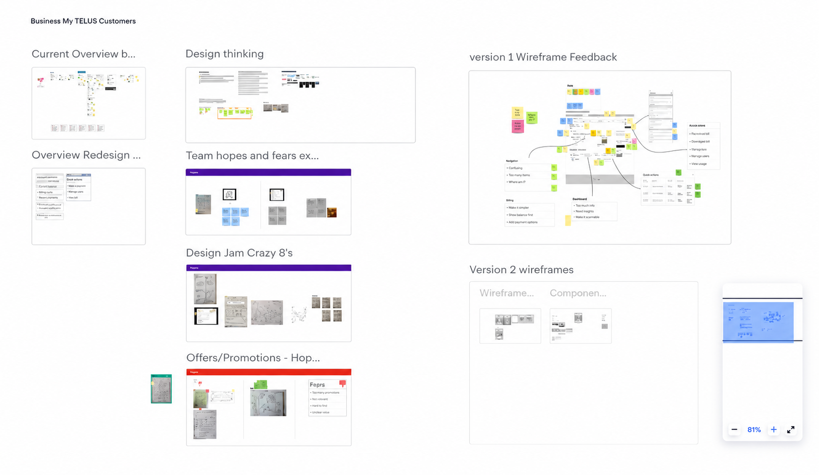
This project was a full redesign: identifying the problems through data and user research, solving them through collaborative design and testing, and rolling out to progressively larger customer segments while collecting learnings along the way.

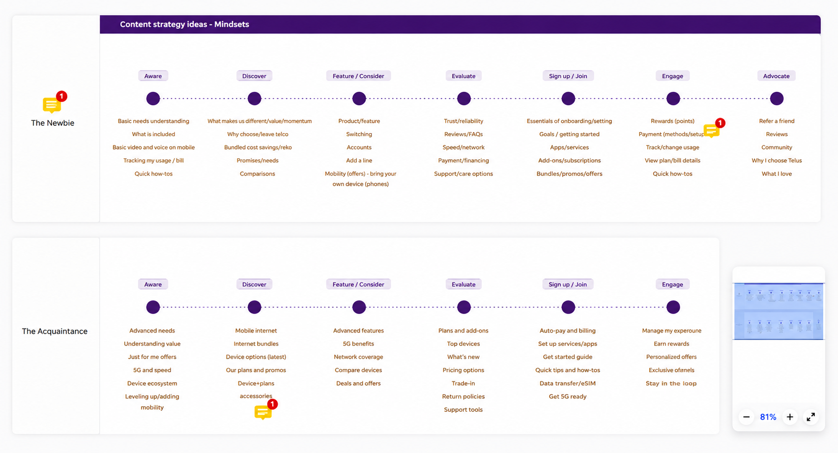
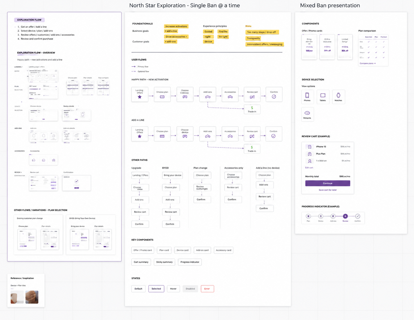
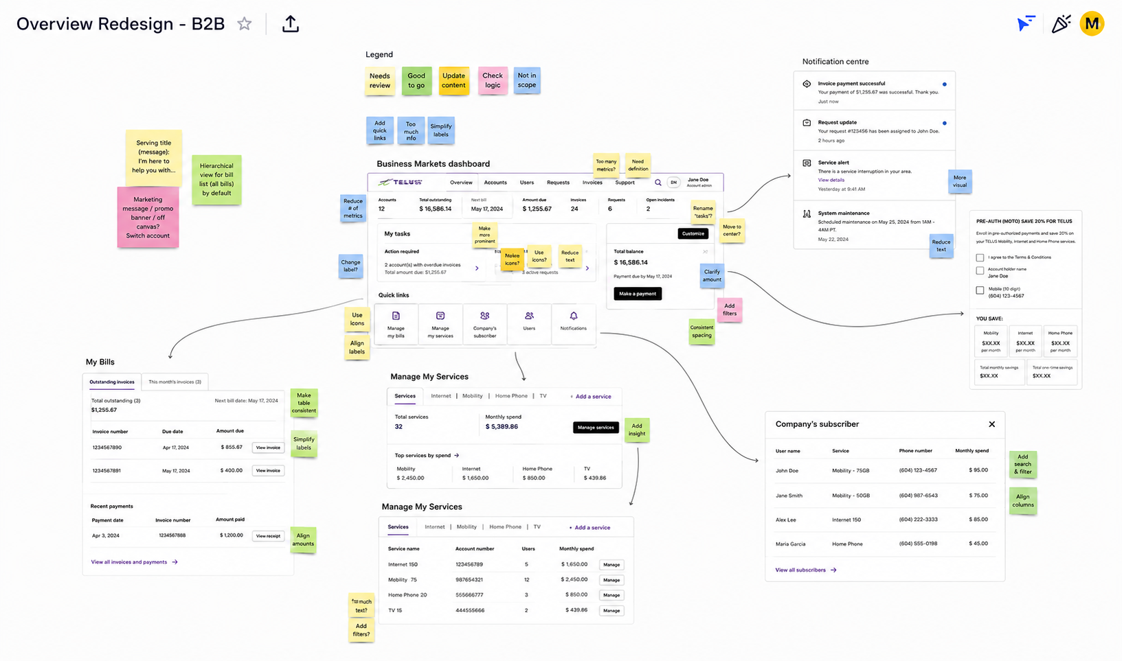
I led content strategy across the full project — owning the content audit, archetype-based personalization strategy, information architecture, and the UX writing that shipped with the redesigned page.

4.2m My TELUS profiles
5.4s Avg. page load time — vs. 3s best practice
20% Of users who scrolled past the fold

Five problems.
One page.

The Overview page had accumulated problems over time — each one manageable on its own, but together creating a page that was slow, cluttered, and failing to serve customers at the moment they needed it most.

5.4s

Slow loading

Current content and design contributed to load times nearly double the 3-second best practice — a significant friction point on a page customers visited constantly.

13%

Billing issues

Customer complaints about viewing and paying bills made up 13% of My TELUS Voice of Customer feedback — a clear signal that the billing experience wasn't working.

Information overload

Too much information on Overview was causing navigation and findability issues. Key content was being glossed over or ignored entirely because everything competed for attention.

20%

Low scroll depth

Only 20% of users who landed on Overview in the last 30 days scrolled at all. Bottom sections received virtually no visibility — making anything placed there effectively invisible.

Hidden features

New features launched in My TELUS were regularly buried within product pages. Other teams were actively requesting a wayfinding solution to surface them on Overview.

Discovery. Design. Deliver and measure.

01 Discovery

Current state review using data and analytics, user research, stakeholder interviews, content mapping and audit.

02 Design

Design jams, content strategy and archetypes, wireframing, feedback collection, stakeholder approval.

03 Deliver

Rolled out to smaller segments first, collecting learnings and iterating before releasing to broader customer base.

Understanding the current state

Discovery started with a thorough current-state review — combining data and analytics with direct customer and stakeholder input. We needed to understand not just what the numbers said, but why customers were struggling and what they actually needed from the page.

Project timeline
Approach Timeline
Content mapping
Zone mapping
User research
User research sample

From insight to solution

With a clear picture of the problems, we moved into collaborative design — bringing cross-functional teams together through design jams and structured exercises like Hopes & Fears and Crazy 8's.

The most strategically significant output of this phase was the content strategy: a north star personalization framework built around customer archetypes. By defining who was using the page and what they needed at each stage of their journey, we identified opportunities to customize the experience in ways that were both technically feasible and genuinely useful.

Design thinking Design jams

Design jams — Hopes & Fears and Crazy 8's exercises run with cross-functional teams to surface ideas and align on direction early.

Content strategy Archetype personalization strategy

Archetype personalization strategy — a north star framework mapping customer types to content needs across the page.

Wireframing Low-fidelity wireframes

Low-fidelity wireframes exploring page structure, IA hierarchy, and content zones before moving into high-fidelity design.

Feedback collection Stakeholder feedback

Stakeholder feedback organized by team and page section — tracking decisions, open questions, and sign-off status across functions.

A jumping-off point, not a one-stop shop.

The redesigned Overview page made the experience more delightful for TELUS customers — reducing page load times, improving findability, driving self-serve activities, and enhancing overall page performance.

Four guiding principles shaped every decision made on the page:

Simplicity

Overview should be a jumping-off point, not a one-stop shop. A decluttered page that helps customers get to where they need to go — not one that tries to do everything at once.

Clarity

Provide relevant information so customers can understand and navigate to complete their top actions easily. Every piece of content earns its place on the page.

Speed

The page uses fewer links and API calls to reduce load times — a direct response to the 5.4-second baseline that was nearly double best practice.

Personalization

Page elements built where data science technology can be applied to create personalized experiences — shaped by the archetype strategy developed in discovery.

Solution — redesigned Overview
My TELUS Overview — final redesigned page

99.4% chose to stay.

Rolled out first to 8% of 4.2m My TELUS profiles, targeting 50% of 930k Business profiles. The results validated the approach — and proved that great UX both reduces support load and increases revenue.

99.4%

Stayed on new experience

Of the 8% of profiles who saw the new design, 99.4% chose to remain on the redesigned Overview page.

+21%

High-value self-serve

High-value self-serve actions increased by 21% — directly offloading support calls and proving the findability improvements worked.

+60%

Daily data top-ups

A 60% increase in daily data top-ups — a direct revenue impact from surfacing the right action at the right moment for the right customer.

Reflection

The number that stays with me from this project isn't the +60% or the +21% — it's the 99.4%. When nearly every customer who encounters a redesigned experience chooses to stay, it means the content did its job: it got out of the way and let people do what they came to do. That's the goal every time.